Your business website is the gateway to the closure of new contracts, services and product sales. It’s your digital visit card. How will you create a visual invitation, something that will create a lasting impression?
Space between elements, effective internal search tools, and creative Web Design Agency ways of inviting the user to interact with your website are some of the things we discuss in this post.
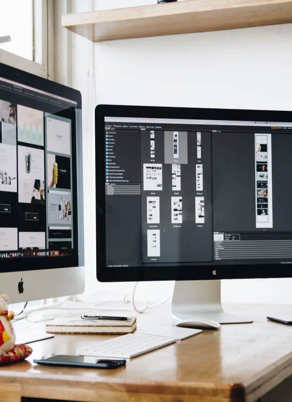
Although each client project will each have their own unique requirements, there are some steps that we have to follow to build a good website. The main point to remember when creating this design is the harmony between beauty and functionality.
We’ve put together our thoughts about some elements that together define the user experience:
1. Less is more
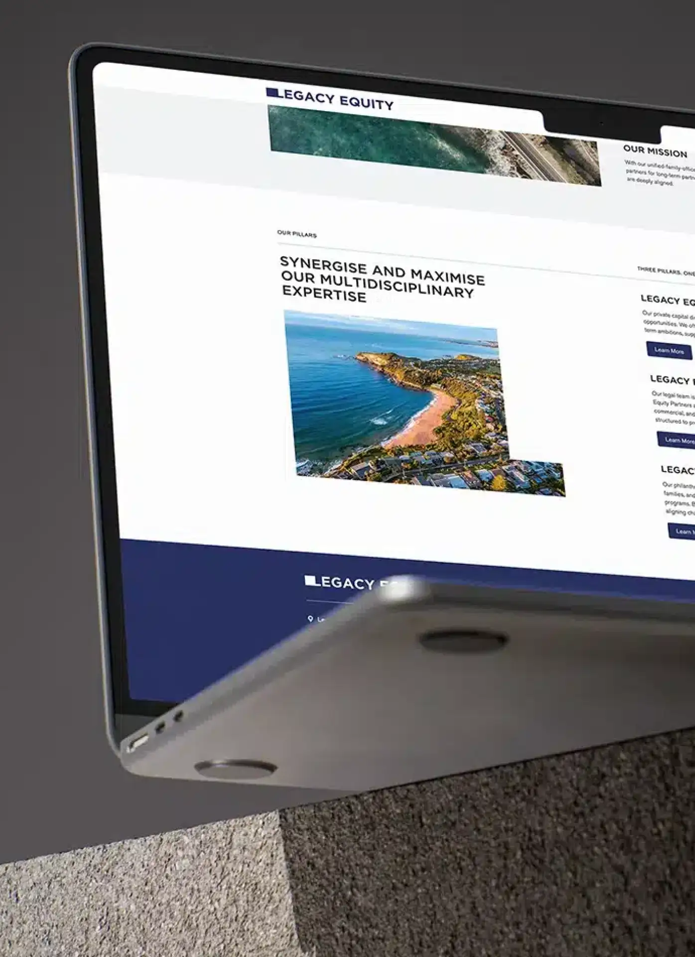
Clear intention is key. Know your why. Always keep it clean and uncluttered. This is the overarching philosophy here at Made Agency is a Creative Web Design Agency. We rarely read all the words on a website. Taking this into account, it is better to appeal to emotion and not to the amount of words. We also suggest using images as alternative ways to communicate your message.
2. Site hierarchy is everything
You have a few seconds to get people’s attention and tell them what your site is about. If you establish a clear hierarchy for your information, readers can easily follow the visual information cues you have left. Then add colour, contrast, size and spacing to give more emphasis, and always be aware of what attracts attention on your page and make sure that it is always intentional.
3. Legibility as principle
The main purpose of a website is to showcase your mad skills, project yourself as an expert, pass on information and most importantly, make a sale, and this can only be done if people can read easily! Good legibility makes all the difference in a website. And for this is not very difficult:
- Contrast is the key. It is very important to have sufficient contrast between the background and the text so that it is very clear.
- You can not read what you do not see. The rule in general is that fonts less than 16pts are not used. But of course that number depends on which font you are using. The point here is that the text is large enough so that people can easily read your content.
4. Navigability to come across as a pro
Solid navigation helps search engines crawl your content, as well as improve the user experience. Your logo should have a link to the homepage for example. This is a common practice that your visitors are already accustomed to and that will save them some valuable clicks.
5. Responsive design is a must
This is not anything new and it’s certainly not the latest innovation, because being mobile is the new normal, but a couple of things to remember: make sure to put yourself in the user’s position and test all the pages, buttons and all actions that the user should take. With the new technological developments, modifying a site for its mobile version is becoming easier. But there are important differences between the big screen web and the mobile web that require special and delicate attention where a web designer can help!
Hope this helps when you’re creating a new website for your brand. We’d love to help you with anything you might want to create for your business. Email us at studio@madeagency.com, we would love to hear from you!
For regular updates on our projects, you can visit our Facebook page: Made Agency Facebook Page