Kingston & Partners is committed to providing high quality legal services to all current and prospective clients. They have a dedicated team of experts, allowing clients quick access to extensive and specialised advice. Their lawyers work in partnership with regulators, industry bodies and clients in order to observe changes in domestic policy to create solutions in accordance to regulations that may affect private lending. This may include consumer credit, wholesale and retail fund licencing and anti-money laundering. Moreover, Kingston & Partner’s sophisticated way of conducting procedures and policies ensures that clients are able to recognize fraud and other threats by mortgagors. Clients typically include private businesses, managed investment schemes and funds, financial institutions and arrangers.
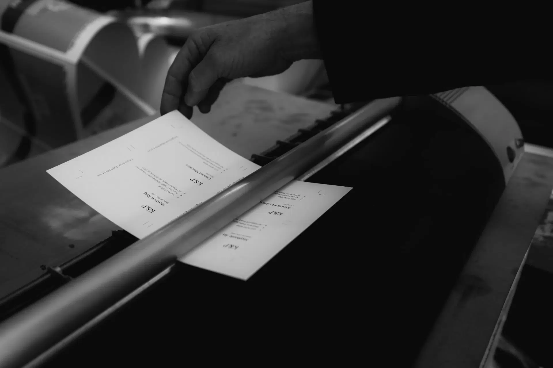
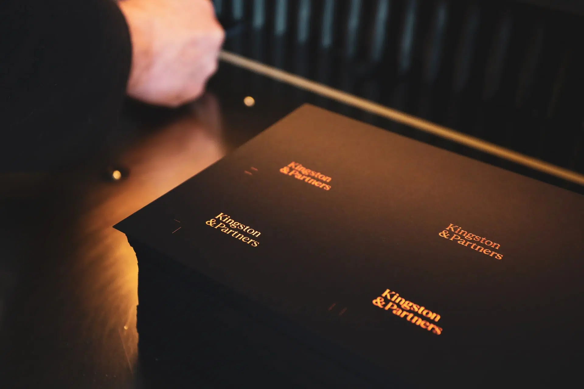
Kingston & Partners align their business principles with three main qualities; unity, integrity and quality. In other words, their culture is built around collaboration and the sharing of knowledge between team members, as well as a dedication to deliver work that goes beyond professional business standards. They pride themselves on delivering success for client’s businesses, given that their success is also their own. Made drew upon these qualities as an important source of inspiration that would help form the graphic identity, in a sense they acted as the brand pillars. The logo system we designed contains a primary and secondary wordmark to be used across all print and digital applications, as well as a supporting acronym. The logo system acts as an anchor for all aspects of the identity and should be used and applied appropriately in line with these brand guidelines. The colour palette we selected contains four colours. The primary colour palette being Kingston copper, Kingston charcoal, whilst the secondary and supporting colour is archival paper and pure white. When combining colours, we considered how contrast would further add to the visual appeal and create complexity within the palette. We chose Berlingske Italic to be used for headings throughout the Kingston & Partners visual identity, this particular serif is ideal for creating hierarchy and visual interest in a digital or print context. Moreover Franklin Gothic typeface was selected to be used for subheadings and pull quotes, it is a clean and clear serif which can be used flexibly. The next particular typefacee plays an important supporting role in place of the body copy across all mediums, this is the elegant and purposeful ‘Graphik ‘serif. Our designers adjusted each of the design elements to be used in a number of applications, including business cards, letterheads, stationary, social media assets, website design and development. We allowed a number of options and flexibility so that Kingston & Partners could tailor the visual framework to their needs.
The new identity reflects the specialised and professional focus of the firm. Made worked very closely with Kingston & Partners to establish a tone of voice that would suggest modernity and a more professional, corporate aesthetic, paired with an established heritage feel. This is the golden balance in our branding process that successfully treads the line between old and new.
Follow us on Instagram and Facebook for regular updates.