A logo is a mark of identity for easy recognition. It is comprised of pictorial or typographic elements and forms part of a bigger identity package to communicate a company’s identity and values. The compression and distillation of meaning from big and complex concepts to a simple mark is what makes a good logo design in Sydney.
What is a good logo design?
- Good logo design is unique – The logo must easily differentiate the company within its industry.
- Good logo design is aesthetic – The logo must be aesthetically balanced and pleasing to the eye.
- Good logo design is understandable – A good logo must be contextually relevant and easy to interpret.
- Good logo design is truthful – A good logo must honestly represent its brand and what the company is about.
- Good logo design is timeless – A great logo must be long-lasting and not follow fashion, graphics or cultural trends that are often fleeting and impermanent.
- Good logo design is comprehensive and encapsulating – The strongest identities are crafted within critical processes. Valued companies have the simplest logos. Simple logos have clear meanings.
- Good logo design is impressionable – A good logo should be easily drawn from memory and able to be versatile and used in multiple touch points.
Three examples of a good logo design in Sydney, Australia
Woolworths
The Woolworths logo had been given a rebrand in 2009, where the “the fresh food people” slogan was made of lesser significance and an icon with the letter ‘W’ was used to represent fresh produce, fresh food, energy, and life. The logo uses green which symbolises nature, growth and organic freshness. The balance in the letter and the round shapes signify balance, well-being, friendliness, humanity, approachability, and openness. The icon is also seen as a positive and energetic person with raised arms. The rebranding proved to be successful in 2011 when the Woolworths Supermarkets was named as Australia’s most valuable brand.
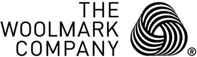
Woolmark
The Woolmark Company is owned by Australian Wool Innovation Limited (AWI), which is a non-profit organisation that conducts research, development, and marketing along the worldwide supply chain for Australian wool on behalf of Australian woolgrowers.
In 1964, the iconic Woolmark symbol was created to act as a symbol to provide independent quality assurance on every wool product that it is tagged. The Woolmark logo symbolises pure wool and good quality and is only used on products made of 100 percent wool. The Woolmark logo as designed by Italian graphic artist Francesco Saroglia has been a key element of the Woolmark brand which has grown to become a globally renowned textile quality brand and wool content label.
SBS
SBS is Australia’s multicultural and multilingual broadcaster. It is a broadcasting channel that stands for diversity and storytelling to connect humanity from all cultures and corners of the earth.
The SBS logo is based on the mercator map which is a flattened view of the world in which we live, representing diversity of views in people from all around the world. The logo was redesigned in 2008 as part of the rebrand of the channel to shed its former image. The new logo uses a lighter-cut Helvetica Neue typeface which presents a fresh and crisp image for the company.
For regular updates on our projects, you can visit our Facebook page: Made Agency Facebook Page