Part of Australia’s landscape since the early 1900s, Hills had a hundred years of recognition sitting in its mark, but an identity that no longer reflected where the business was heading. The brief wasn’t reinvention; it was evolution.
We returned to the original Hills mark and distilled its essentials, the horizontal crossbar, the arcs, the directional forms, reinterpreting them through a contemporary lens. The identity centres on a refined “H” monogram, where a sweeping arch bridges the company’s origins and its place in modern healthcare: structure for heritage and strength, movement for innovation.
From that arch we drew a graphic device, the circular form within it expanded into a system of fine radial lines, moving clockwise to add momentum and a subtle nod to technological progress across every application.
We delivered the complete system, logo suite, colour, typography, iconography and layout principles — as a full set of brand guidelines, then took the brand live across every touchpoint, digital and print.
One unified identity: structured, progressive, and confident, honouring its past while moving clearly into the future.
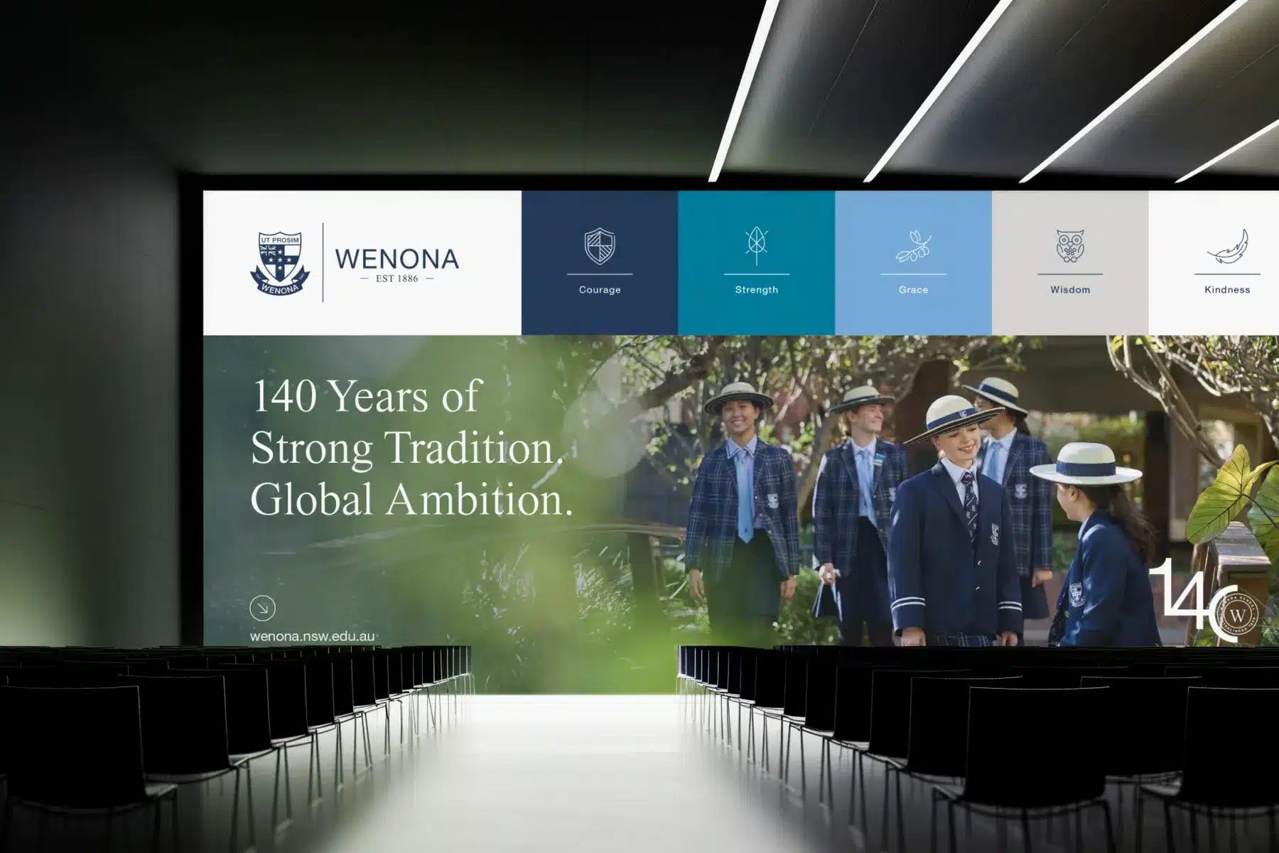
Wenona School engaged Made Agency to evolve its brand at a defining moment in its history. Established in 1886 and recognised for academic excellence and character-led education, the school embodies a clear duality — grounded in heritage, yet progressive in outlook. This insight shaped the brand platform: Strong Tradition. Global Ambition. A positioning that honours Wenona’s legacy while expressing its forward momentum. We refined the existing crest with precision — widening the shield, redrawing the wordmark, refining the ribbon and...