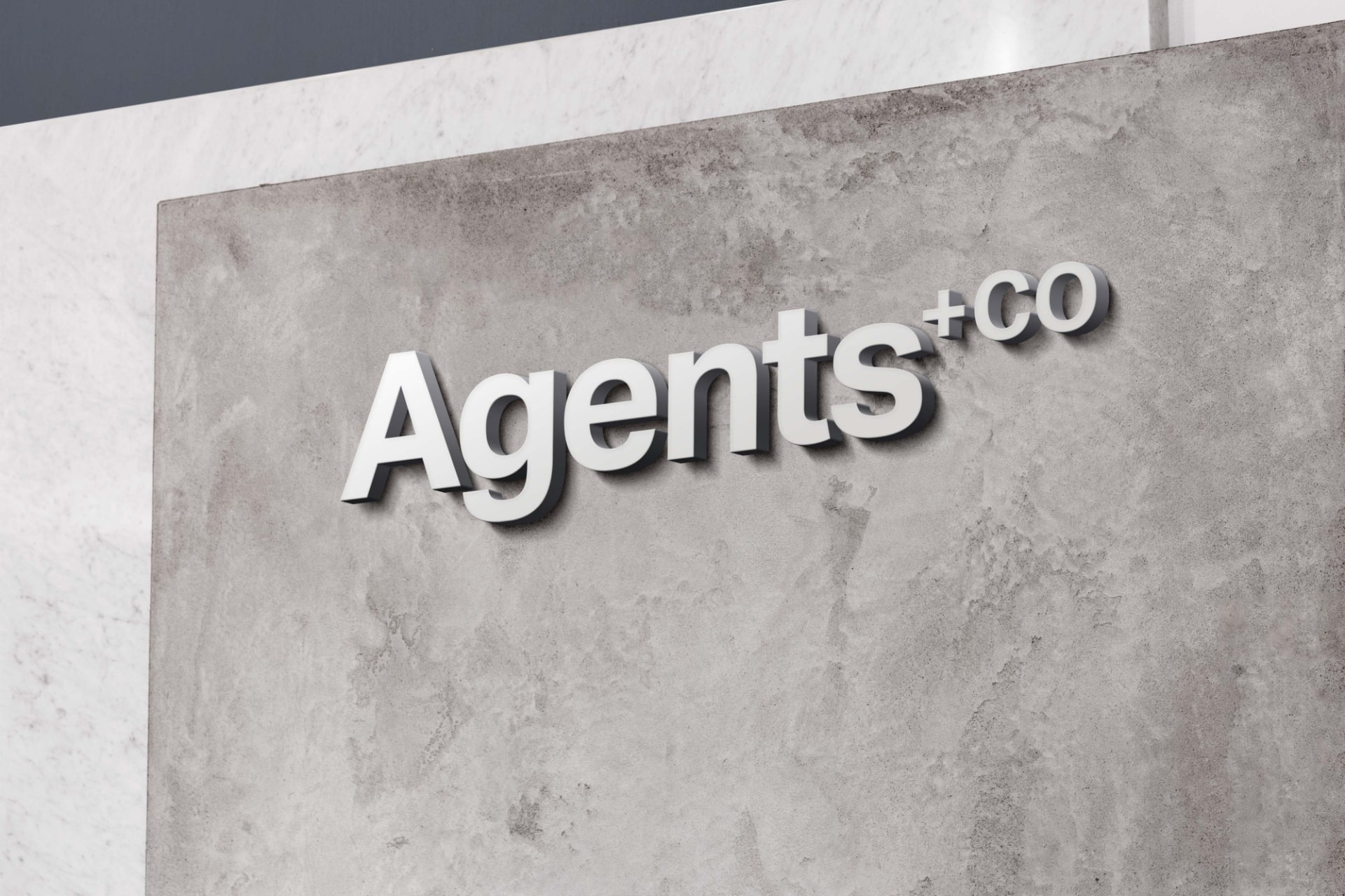
In the ever-evolving marketing and branding landscape, businesses are constantly looking for innovative ways to stand out and make a lasting impression on their audience. One often underestimated yet powerful tool in a brand’s toolkit is typography. How a brand presents its message through typography can significantly impact its identity and recall. Let’s dive into this captivating world in branding and explore how to use it effectively to create a compelling and memorable brand image.

Typography is more than just arranging letters and words on a page; it’s a form of visual communication that can convey emotions, values, and even cultural nuances. When used strategically, it can become a brand’s voice – an authentic and recognisable element that resonates with the target audience.
Creating Visual Identity through Typography
It plays a pivotal role in establishing a brand’s visual identity. The choice of fonts, styles, and layouts can communicate a brand’s personality – sleek and modern, playful and creative, or classic and timeless. For instance, a tech startup aiming to convey innovation and futurism might opt for clean, minimalist fonts, while a vintage clothing store might lean towards ornate and nostalgic typefaces.
Typography Evokes Emotions
Different fonts evoke different emotions. Serif fonts convey tradition, reliability, and authority, while sans-serif fonts are often associated with modernity, simplicity, and approachability. By carefully selecting typography, brands can evoke specific emotional responses from their audience, establishing a deeper connection.
How to Use Typography for Brands
Consistency is Key: Establishing a consistent typography system across all brand materials – from logos to websites to packaging – is essential for brand recognition. Consistency builds trust and makes the brand easily recognisable, even without a logo.
Legibility Matters: No matter how stylish a font might be, if it sacrifices legibility, it hinders effective communication. Brands should prioritise legibility to ensure their message reaches the audience without barriers.
Pairing Fonts for Harmony: Typography in branding often involves combining different fonts to create a harmonious and balanced visual. Pairing a bold, attention-grabbing headline font with a clean, easy-to-read body font can enhance readability and overall aesthetic appeal.
Cultural Sensitivity: Brands with a global reach must consider cultural nuances when choosing typography. Specific fonts may hold cultural significance or be associated with particular regions, so ensuring that the selected typography is respectful and appropriate for all audiences is vital.

Iconic Brand Examples
Coca-Cola: Coca-Cola’s iconic cursive script is instantly recognisable worldwide. The flowing letters evoke a sense of friendliness and timelessness, making it one of the most memorable typography choices in branding history.

Google: While primarily known for its search engine, Google uses a distinctive and playful typeface called “Product Sans” in its logo and various products. The typography reflects the brand’s commitment to user-friendly design and innovation.

Typography is a silent yet powerful brand ambassador; brands that harness the potential strategically can create a unique and memorable visual language that resonates with their audience. Made Agency has a proven track record of expertly utilising typography in our clients’ brands, collateral, and websites; we ensure that each brand effectively communicates its identity.
Our team understands the nuances of typography and its role in branding, allowing us to craft visual narratives that leave a lasting impression. Contact Made Agency today to discover how we can help your brand speak volumes through the art of typography.
Contact us for more information on our services.
Phone: (02) 8007 7083
E-mail: studio@madeagency.com


