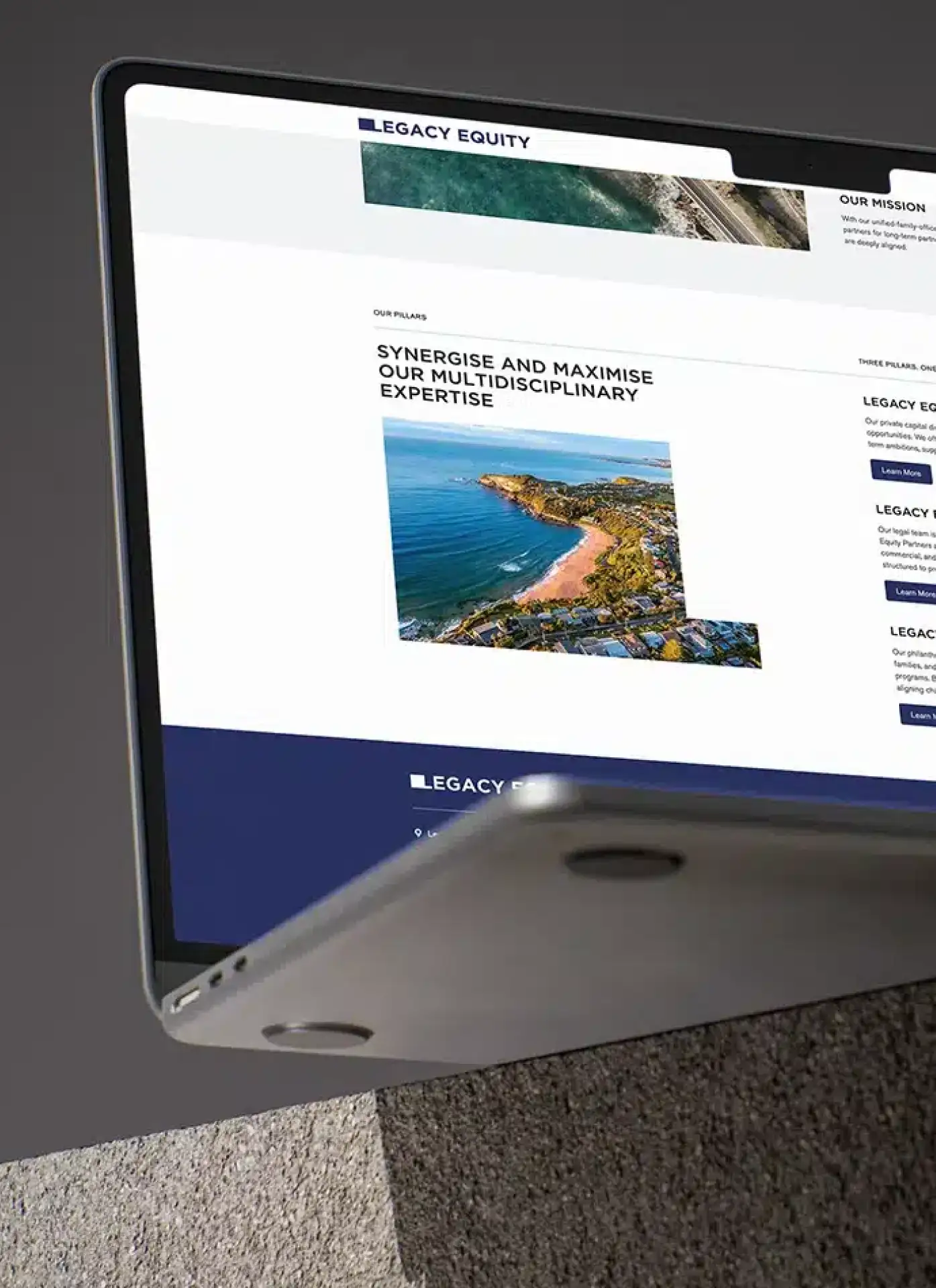
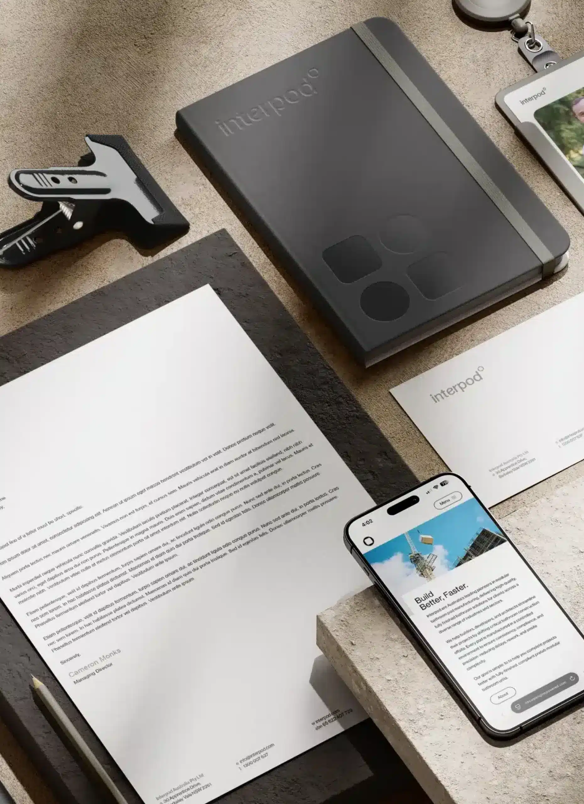
Typography is an important aspect in the overall design of your website. It assists in communicating ideas, giving the page a sense of structure and showcasing your content. There are many options of typography for designers to choose from, including serif, sans-serif, script and decorative. Our website design agency team knows that choices in typography can greatly impact the overall design aesthetic of your new website, so it is crucial to get it right.
Our website design agency team goes through do’s and don’ts when it comes to choosing typography for your new website.
Do’s:
- Make it legible and clear
It is essential that users can easily read all the typeface on your website. Using typefaces that are overly cursive or use an unclear handwritten style can make text illegible. If text is hard to read, users may misinterpret messages or give up on trying. - Have space between the lines
The text needs room to breathe! No matter what style of typeface chosen, there must be enough space between the lines to assist in ease of reading. This will help users get more from your website because they will feel less overwhelmed by the text. - Use background colour contrast
For the text to stand out, a good level of contrast must be chosen between the text and background colour. If the colours are too similar or dull in contrast, messages will not be received effectively. Choose colours that go with the overall theme, but make the typeface clear to read and stand out from the background.
Don’ts:
- Make the text too small
Text that is too small makes for unpleasant user experience. It is hard to read and deters people from reading your content. It is important that a good-sized type is chosen to ensure you maximise your website’s potential. - Use of a range of fonts
Using a range of fonts can be distracting and detract from the aesthetic of the website. We recommend a maximum of 2-3 fonts to avoid websites looking overwhelming. - Overdo emphasis
Using an overload of italics, bold or underline can look tacky and is unnecessary. When used sparingly, emphasis can be a great way to enhance your message, but it must be done carefully.
Leave it to the experts! Call us today on 1300 877 503, or email studio@madeagency.com to see how we can help you with your website design needs.
For regular updates on our projects, you can visit our Facebook page: Made Agency Facebook Page


