What is Colour Psychology?
Colour psychology explores how colours affect human behaviour, emotions, and perceptions. In graphic design, understanding these effects can significantly influence how a brand is perceived and how its message is translated.
The Basics of Colour Psychology
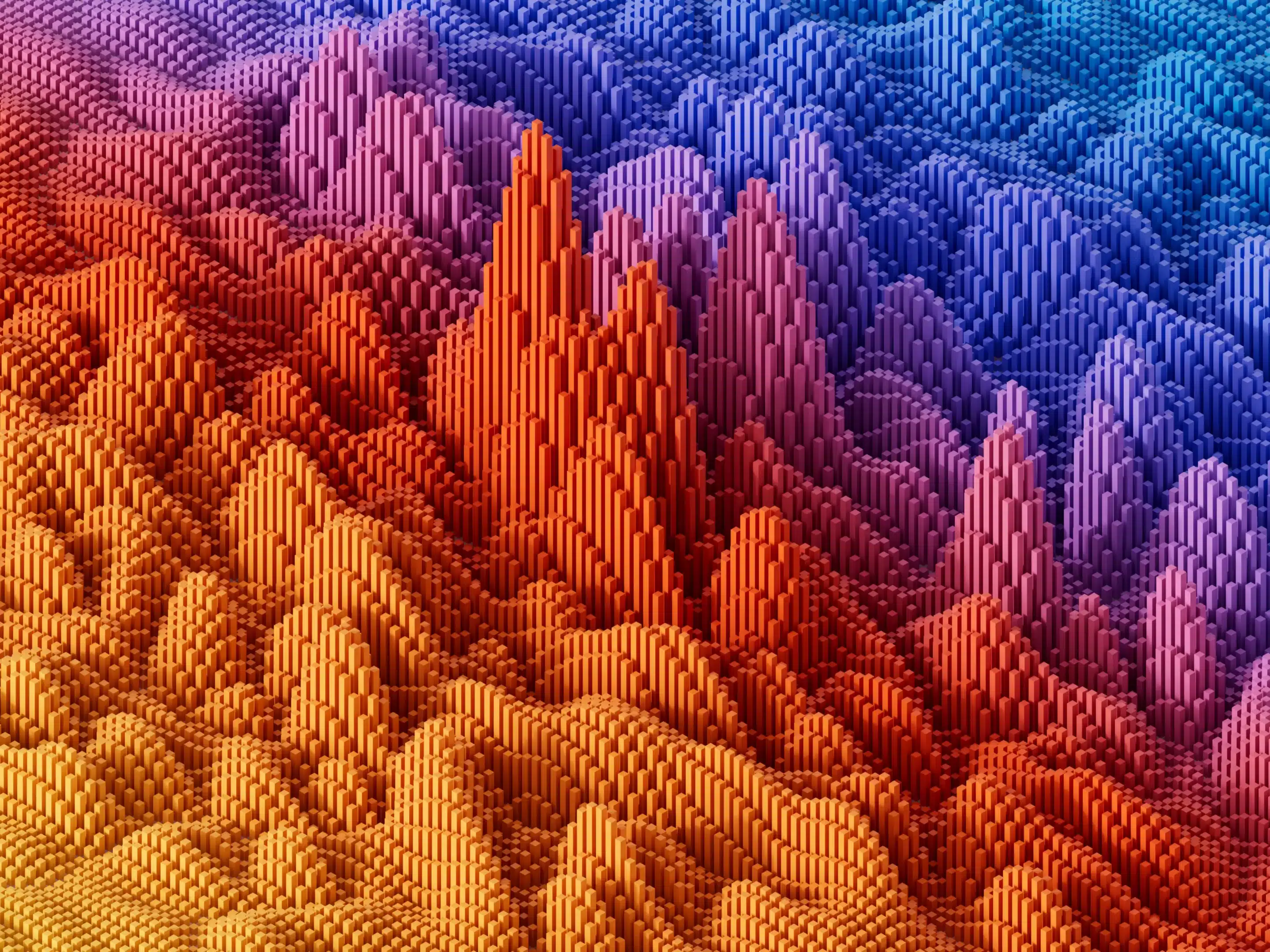
Colour psychology categorises colours into groups based on the emotions and associations they evoke:
- Warm Colours (e.g., red, orange, yellow): These colours evoke feelings of energy, passion, and warmth.
- Cool Colours (e.g., blue, green, purple): These colours are calming and often associated with tranquillity and trust.
- Neutral Colours (e.g., white, black, grey): These colours convey simplicity, balance, and clarity.
Each colour group has nuances that can be leveraged in graphic design to convey specific messages and evoke desired emotional reactions.
The Impact of Colour Psychology in Graphic Design
In graphic design, colour choices can have a profound impact on the following:
- Brand Identity: Colours can help define a brand’s personality and differentiate it from its fellow competitors.
- User Experience: Colours influence how users interact with websites, apps, and printed materials.
- Call-to-Action: Effective use of colour can guide a user’s attention and prompt desired actions.
- Emotional Response: Colours can evoke specific emotions that resonate with the target audience.
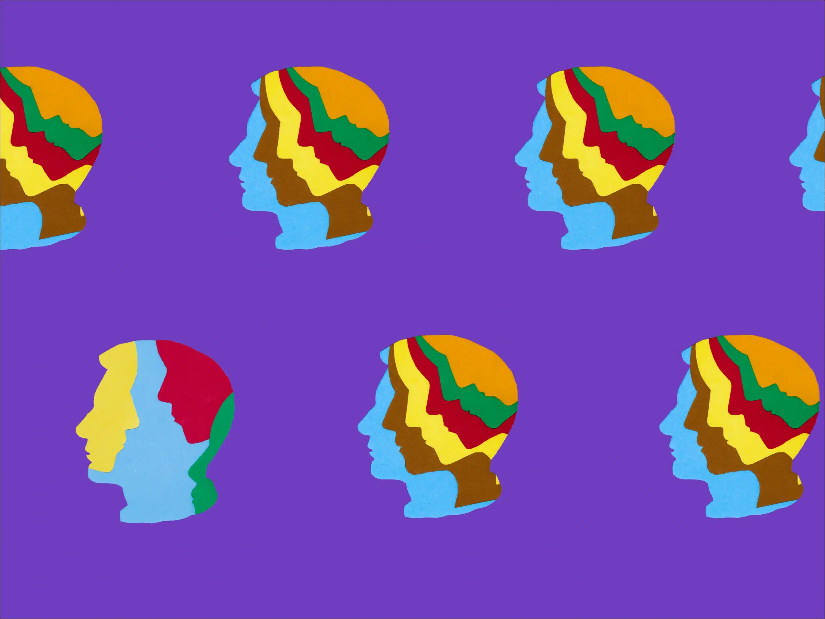
The Psychology of Colour in Graphic Design
Understanding the psychology behind each colour can inform design decisions:
- Red: Associated with passion, energy, and urgency. Often used to grab attention or promote excitement.
- Blue: Resonates with trust, reliability, and calmness. Commonly used in corporate branding.
- Green: Represents growth, nature, and health. Often used in eco-friendly or organic brands.
- Yellow: Signifies optimism, clarity, and warmth. Used to convey positivity and happiness.
- Purple: Evokes luxury, creativity, and royalty. Used in brands aiming for a premium image.
- Black and White: Symbolises simplicity, elegance, and contrast. Used to create a clean and sophisticated look.
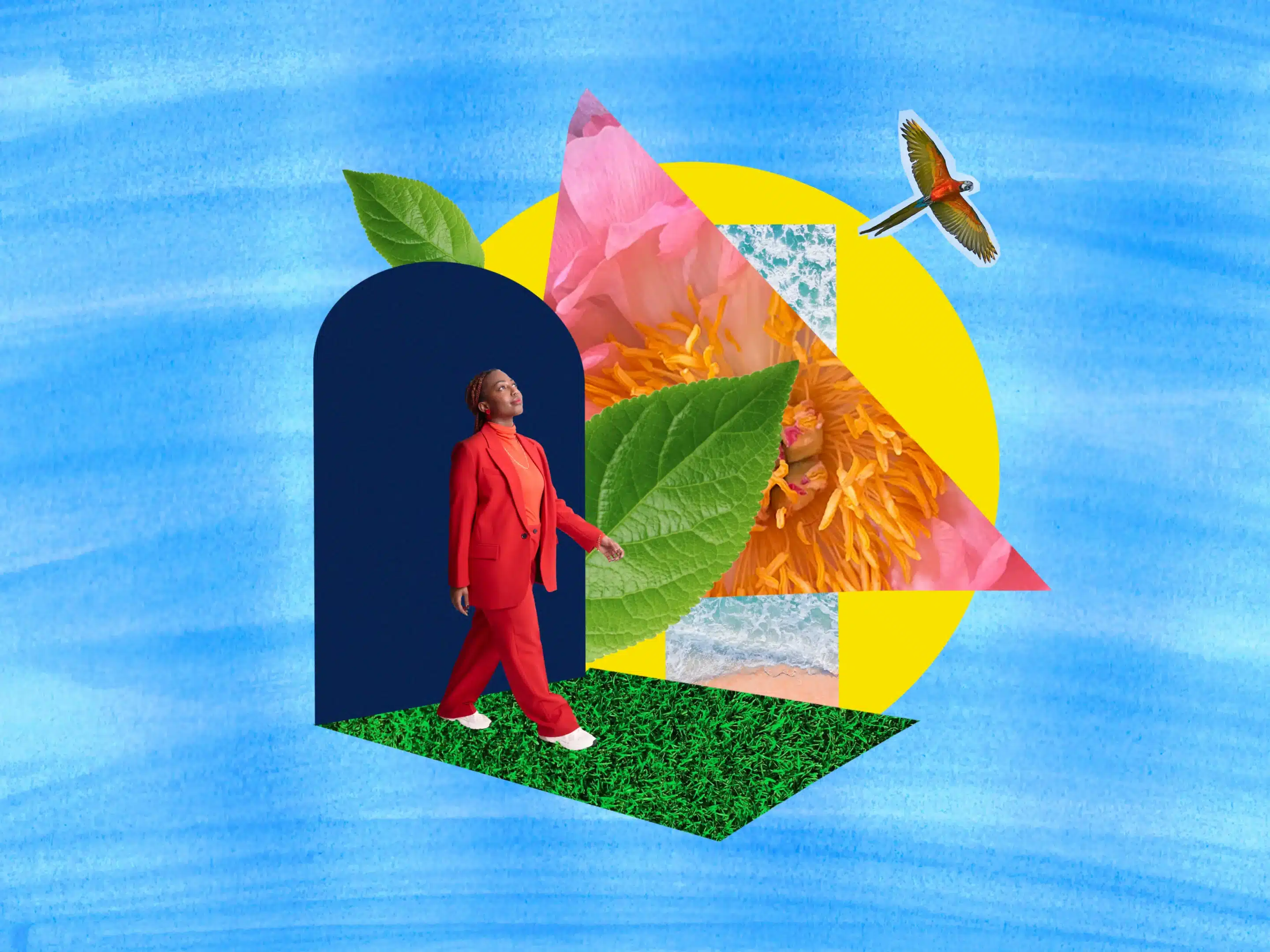
Colour Psychology in Graphic Design Applications
Practical applications of colour psychology in graphic design include:
- Logo Design: Choosing colours that best align with the brand’s values and target audience.
- Website Design: Creating a visually appealing and user-friendly interface.
- Marketing Collateral: Using colours strategically to reinforce key messaging and brand identity.
Why Made Agency Excels in Colour Psychology for Graphic Design
Made Agency specialises in leveraging colour psychology to create impactful designs that resonate with audiences. Their expertise ensures that colours are used effectively to enhance brand identity and achieve communication goals.
Getting Started with Made Agency
Partnering with Made Agency for your graphic design needs ensures access to expert knowledge in colour psychology. We make the process seamless, from initial consultation to final design, ensuring your brand communicates effectively through strategic use of colours.
Let’s Collaborate
Contact Made Agency today to discuss how we can collaborate and explore new possibilities together.
Phone: (02) 8007 7083
E-mail: studio@madeagency.com
