The first impression a user makes when they click onto your website is an important one. Studies have found that it takes less than one second for a web user to form a first impression upon opening a website.
This is why it is essential to your success that you nail that landing page. The ultimate goal of your website is to maximise visitor conversions and the first thing to address in achieving this goal is to build and maintain a well designed landing page.
The first thing some web designers think of doing when trying to build a superior landing page is to be unique and inventive, when really, the most successful designs are usually quite simple and stick to conventional website structures. Below, are some tips on what makes a good custom landing page design company and how you can optimize this page to increase visitor conversions.
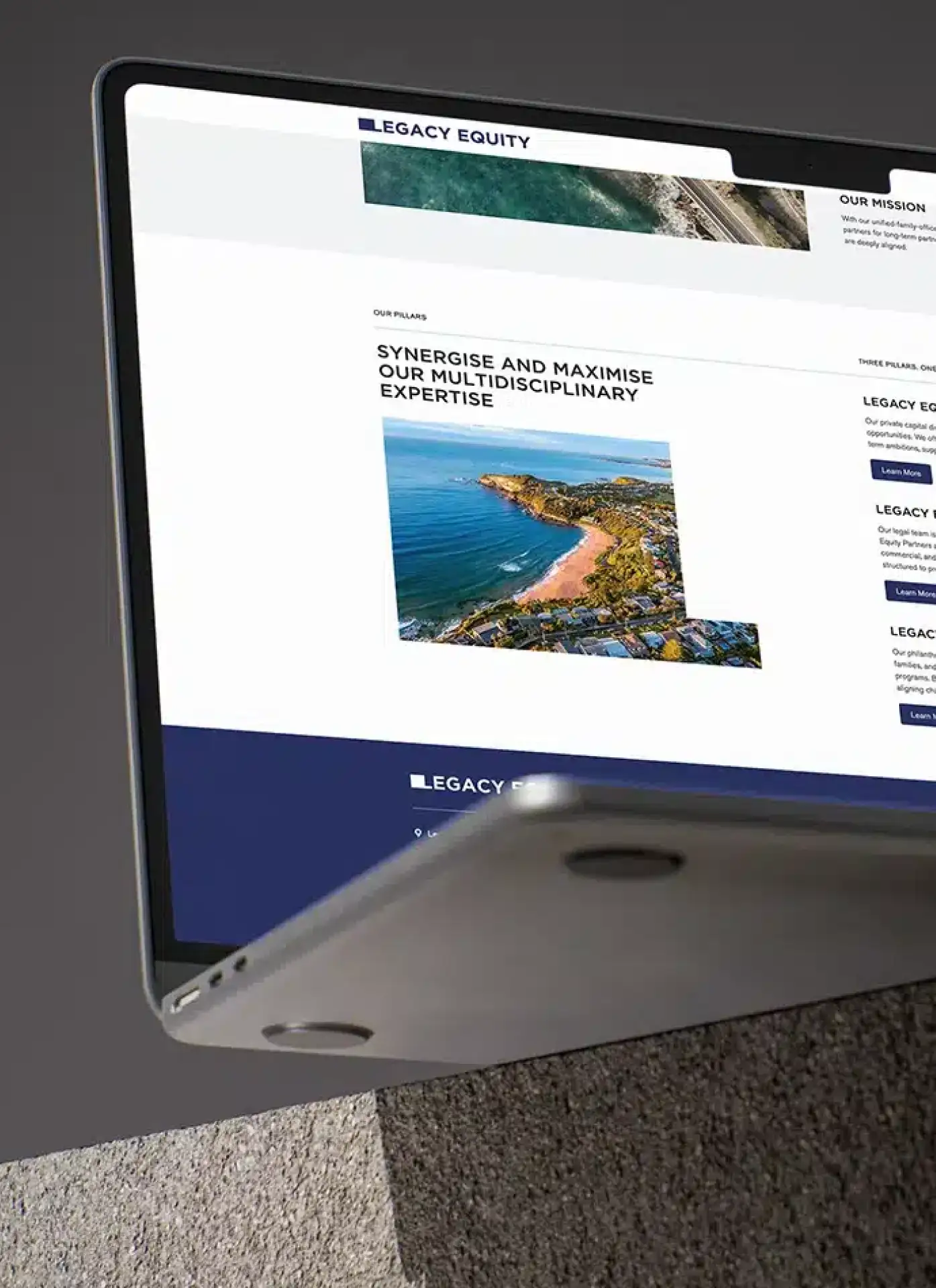
1. Website Headline
One of the fundamental elements of landing page design that you should tackle first is your headline. This is generally one of the first things that visitors to your website will see and it should clearly state what your website’s ‘offer’ is.
A website’s ‘offer’ varies from website to website and it might be as simple as consistent blog posts. Your website will not appeal to everybody that visits it so try and keep your headline and subheadline targeted towards the people more likely to stick around. Your subheadline should answer any questions users might have about your offer or confirm what your websites about. Nevertheless, your headline needs to be visible, clear and concise. Avoid confusion and strive for less words; your sub-headline will go into more detail about your offer.
2. Call-To-Actions
Once you’ve got your headlines sorted it’s time to take a look at your calls-to-action (CTA’s). If you’re not familiar with the definition of a call to action, it is basically a piece of content designed to induce the user to perform an action. For example, ‘subscribe’, ‘sign up’, ‘buy now’ are all calls to action.
CTA’s are such a vital component of your landing page as they ultimately assist in keeping a portion of your websites traffic sticking around. In saying this, try to keep these buttons above the fold and have at least 2 or 3 on your landing page. Make them stand out from the rest of your page so that visitors are visually drawn to them on arrival. You should also optimize these CTA’s for mobile use so that they are easily accessible and prevent the chances of users tapping on something they didn’t want to. Successfully implemented CTA’s should help increase and maintain traffic to your website.
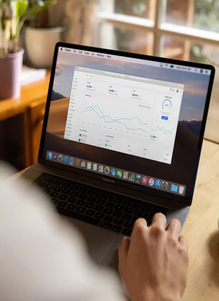
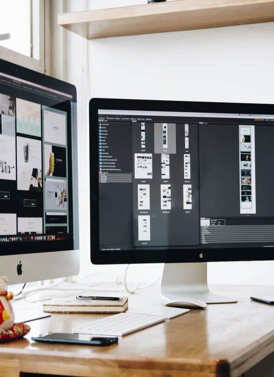
3. User of Images
Our next tip, almost as important as the first 2, is to use images. Lots of people are quick to leave websites when they can’t find what they want almost instantly. Others leave because they can’t be bothered to read an unnecessarily wordy description of a website’s offers.
Avoid losing visitors for both of these reasons by using images that capture the essence of what your website is all about. Optimise the image so that it looks good on both a computer and mobile device and make sure that the image clearly expresses the nature of your offering.
In doing the simple points above, you’ll be better able to capture that impatient percentage of users who visit your website.
If you’re keen to improve on the branding and overall presentation of your website, contact us at studio@madeagency.com
For regular updates on our projects, you can visit our Facebook page: Made Agency Facebook Page