Novoa arose from a need to help people achieve a healthy, sustainable lifestyle through pain-free movement. They prioritise providing professional, empathetic and human-centred services that help clients return to enjoying what moves them. They are a forward-thinking, dynamic business that seeks to progress their company with a flexible, adaptable attitude. They believe this is essential to shift with the ever-changing nature of the world.
Our chosen mission statement accurately reflects Novoa’s message to consumers: to move is to be human. Novoa’s aim as a business is to aid clients in cultivating a healthy relationship to their bodies through adaptable, empathetic and trustworthy service. Novoa operates locally inside a highly specialised and expert area of allied and health recovery which requires a high degree of professional expertise and knowledge in their field.
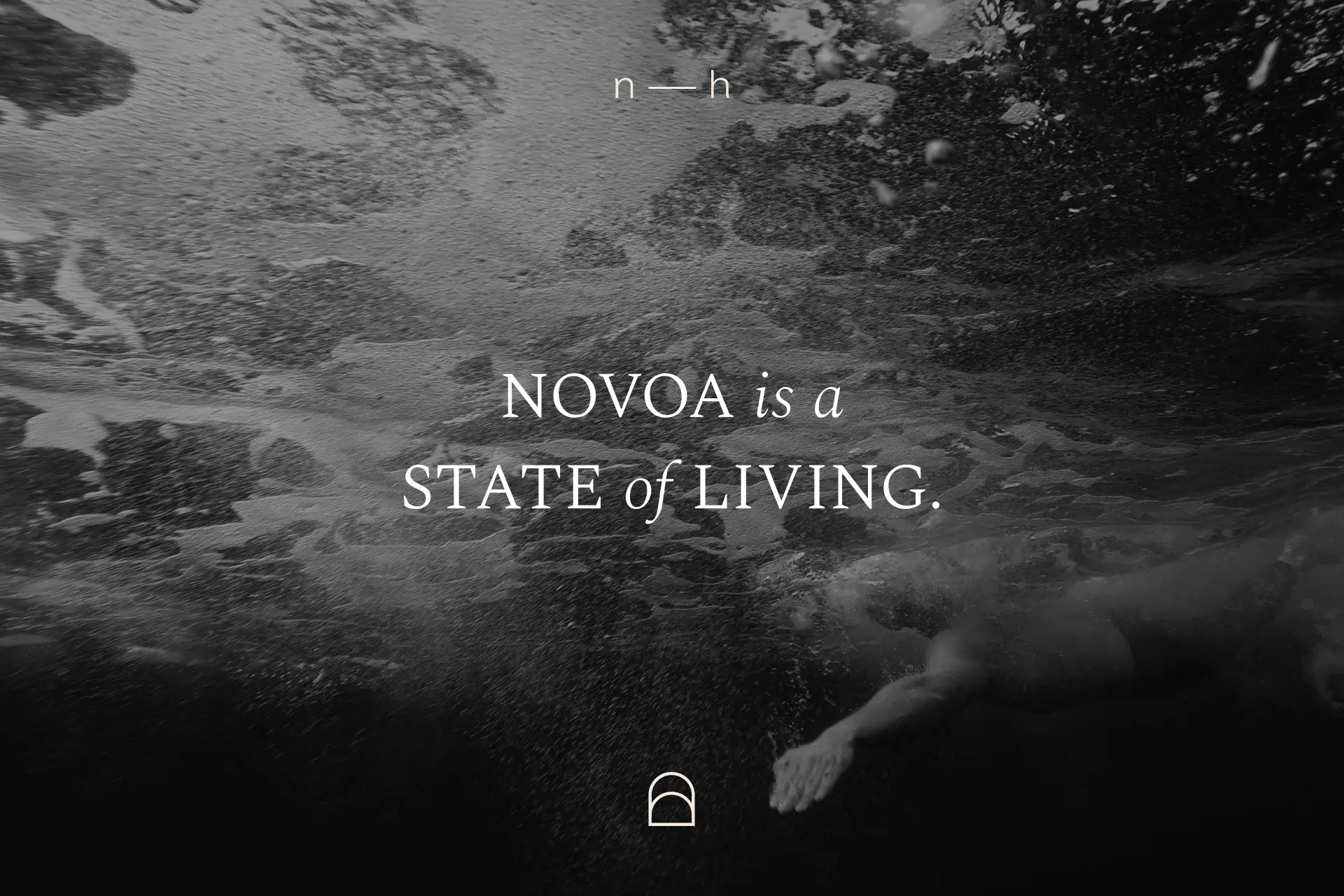
Made created a comprehensive identity that touched on all the important elements Novoa wished to express with the launch of their new company. The name Novoa is inspired by nature, the universe, spirituality and consciousness and is synonymous with the authentic, holistic feel of the visual identity. The brand name would later form the primary wordmark, which used custom typography unique to Novoa. We also created a supporting acronym wordmark to be used simultaneously, but to never appear in the same place as the primary wordmark.
Further design features included the supporting graphic icon, this particular icon was inspired by key elements in nature and wellness. The bottom section of the icon is symbolic of a sunrise and mother nature whilst the section above represents the doorway to a better life, or more specifically better mobility, recovery or wellness. We have cleverly designed the rounded arch to resemble an ‘n’ letter, the starting letter of our chosen brand name, Novoa.
We worked extensively on the proposed colour scheme, which included rich, deep and warming tones to strike a balance between earthy notes inspired by nature. Ultimately a stripped back, modern, premium colour palette was born, with an additional high-quality print finish option as well.
Finer details of the brand extension included stone engraving references for the interior design/entrance consideration and additional supporting graphic elements such as the gradient dotwork design. This particular element suggests movement, flexibility, muscle engagement and is also inspired by the ebb and flow of sandstone texture. We also extended our dotwork design to a print collateral concept which displayed a contrast between our copper foiling finish and a dark shadow colour from our proposed colour scheme. The copper detail entices anyone to move the printed material around to see the shine of the copper. This design is intrinsic to movement and human nature and ties into the brand tone of the voice.
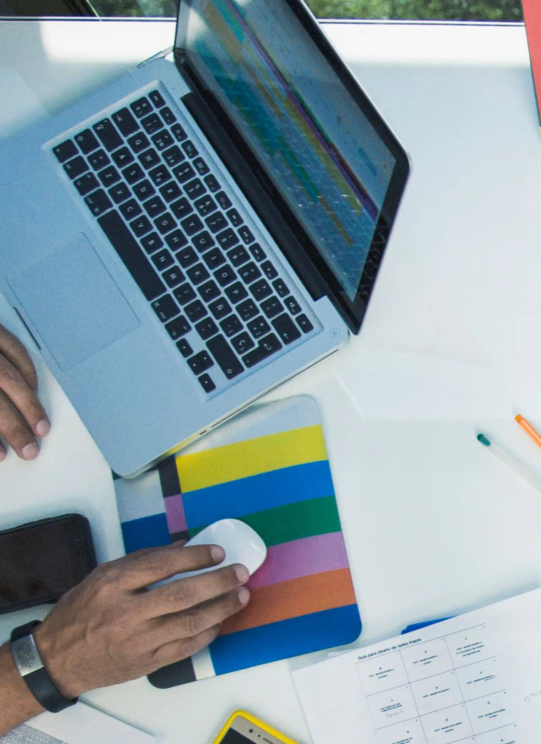
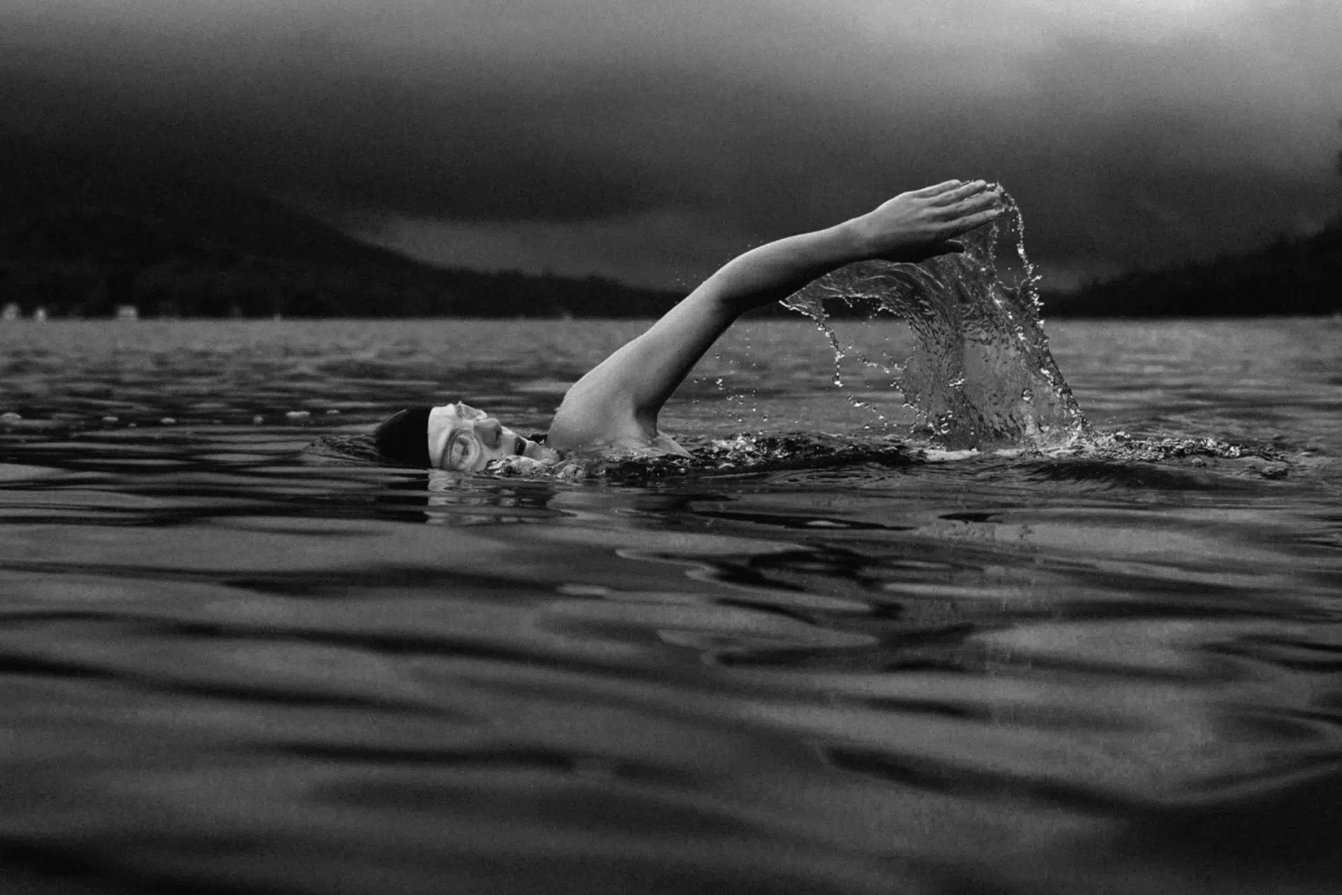
Our proposed art direction style consisted of low contrast and artistic greyscale photography to reflect a premium aesthetic. The chosen visuals are a reflection of the humane, more organic features of the brand identity.
It was a joy to work with Novoa in the collaborative design, branding and marketing process for the launch of their new company. We were able to take our creative development to the next level and produce a high-quality, premium visual identity that is reflective of the professional, highly specialized health services Novoa delivers to their valued clients.
Follow us on Instagram and Facebook for regular updates.