Transeal is a company that provides caulking services to Australia’s most reputable builders and construction firms. They specialise in external works on building facades such as caulking for cladding panels, glazing, brickwork and all forms of latest façade treatment. Their internal works consist of all forms of final finish caulking such as bathroom, kitchen, laundry and common areas.
Transeal consistently produces high-quality work which has earned them the reputation of being one of the best caulking firms in the industry. In other words, Transeal is dedicated to pursuing excellence in all facets of delivery, from initial contact and client relations to unrivalled caulking services.
Whilst Transeal had already established a reputation of producing premium work, they required a cohesive identity to express the message and tone of voice behind their brand. The visual identity we proposed consisted of forming the logo, colour scheme, typography, marketing avenues and imagery.
The logo utilises a sans-serif typeface that has a rich industrial, engineering pedigree, first created for German industry after WWII. The two dots on top of the Transeal name pay homage to Transeal’s most valuable tool: the caulking gun responsible for sealing the cracks and gaps in exterior and interior spaces. We chose orange as a reflection of Transeal’s optimism and commitment to innovation, orange is the brand’s chosen primary colouring, however the logo can also appear in black and white where appropriate.
Moreover, the outside area of the logo was deliberately designed to be an empty space so the Transeal name could stand out and create a sense of impact. The brand tagline is a further reflection of the Transeal tone of voice and visual identity, with the option of appearing underneath the Transeal logo allowing space in between each part.
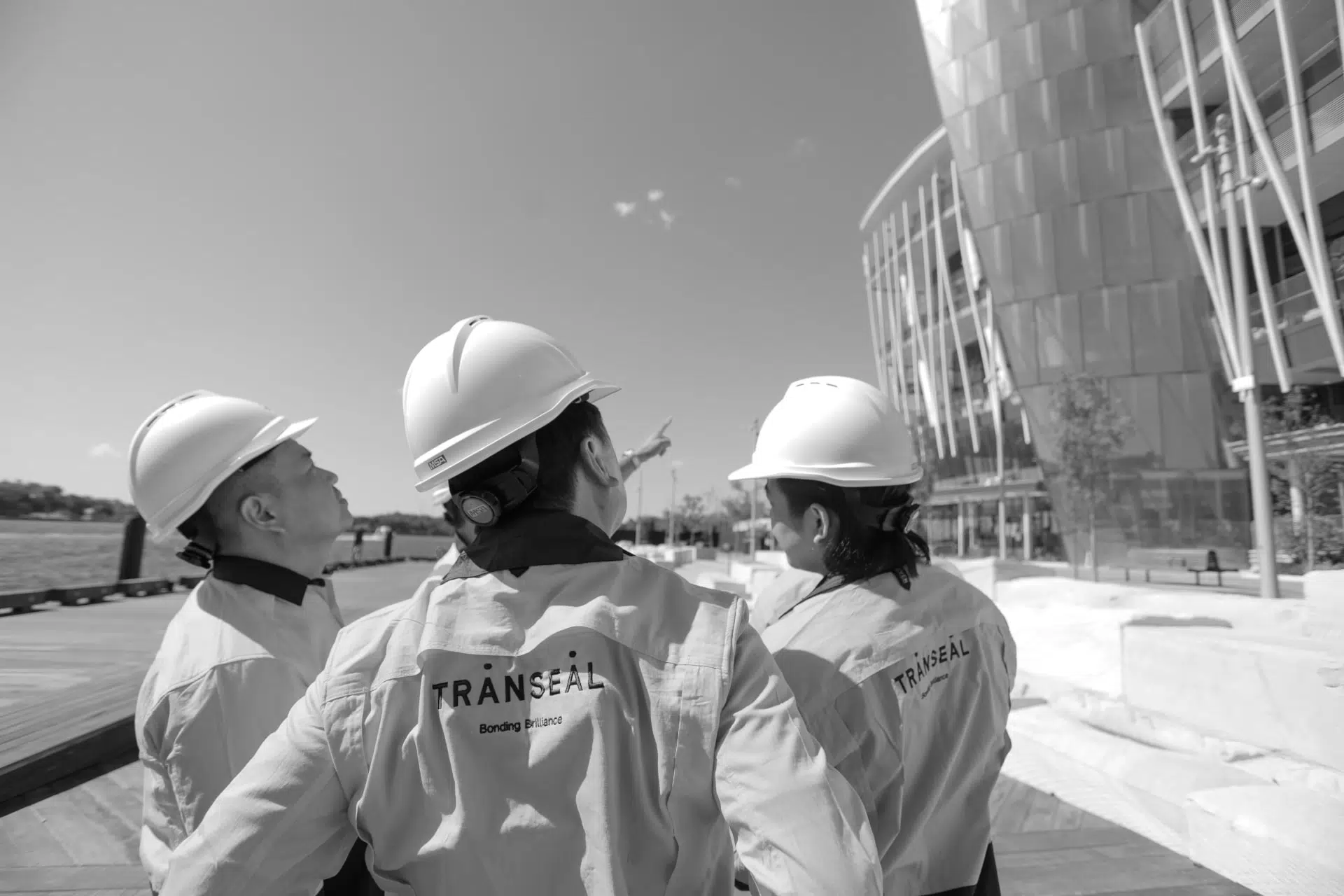
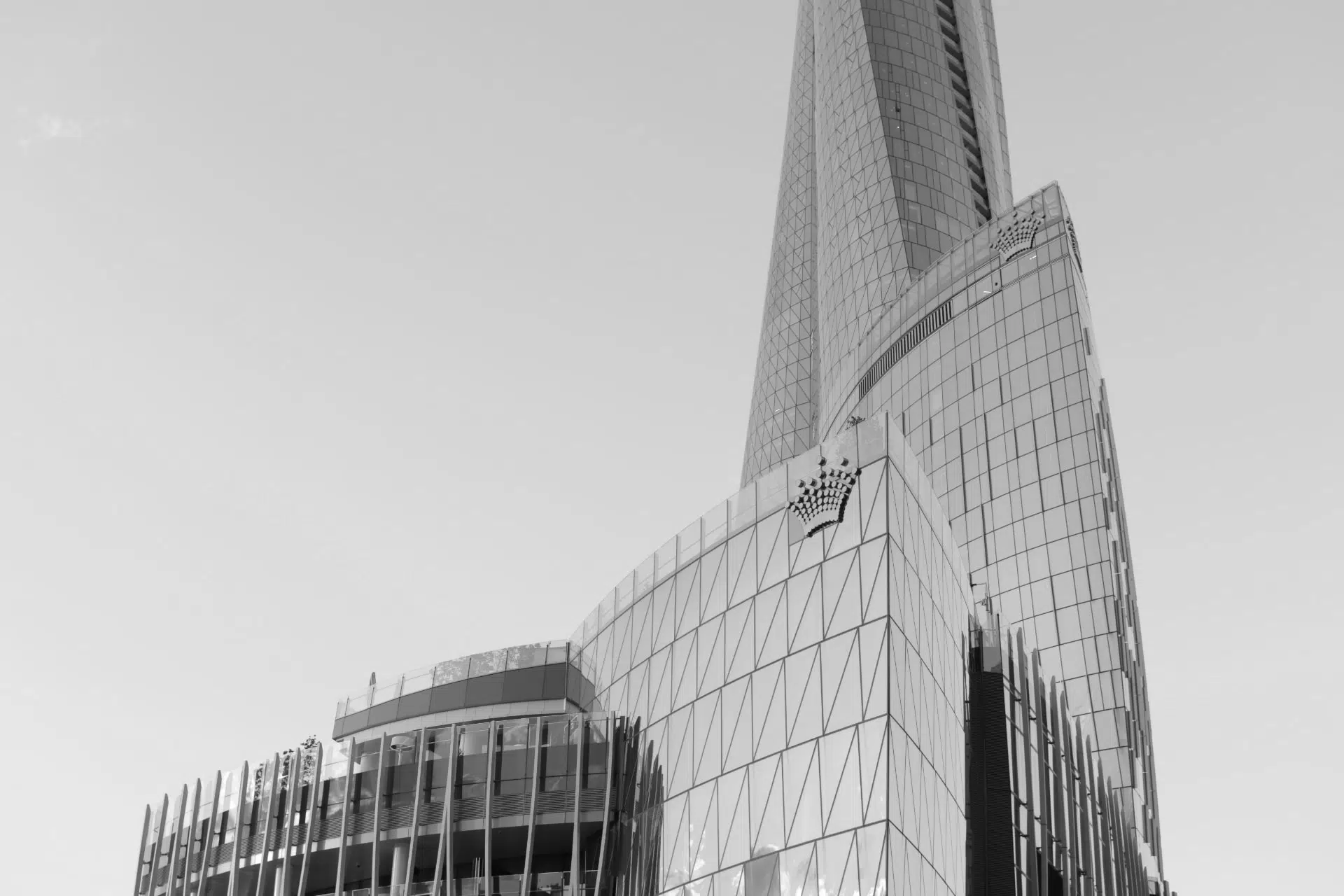
The imagery and photography were a key element of the brand communications. Made worked closely with Transeal to select sharp, beautiful images that highlighted their impeccable work. This also allows the audience to have a direct and emotive connection to the brand.
We also created the designs for smaller details such as business cards, email signatures and other stationary.
In line with creating a visual identity across all platforms, Made considered all avenues for the company marketing in order to create a seamless cohesion of design elements. This included the company car which resembles the bold and recognisable design in the logo, as well as employee uniforms and safety wear. Having the logo and brand design on uniforms and safety wear exposes the brand to wider audiences on a daily basis and give people incentive to remember the brand. Not only that, it encourages a sense of unity and makes employees feel as if they are part of a team.
Made thoroughly enjoyed working with Transeal to achieve a high-quality, premium brand identity that was in line with the level of excellence evident in Transeal’s work. The design process was a thorough and collaborative effort that resulted in an innovative, modern and sophisticated brand framework that covered every element of the updated and improved visual identity of Transeal.
Follow us on Instagram and Facebook for regular updates.